Sam Entretenimento
Client
Sam Entretenimento
Sector
Entertainment
Category
Redesign
Year
2024

→ Situation
SAM Entretenimento is a Brazilian company founded in 2024 bringing Korean cultural experiences to Brazil. In just over a year: 10,000+ attendees, events across 3 cities, and 162K Instagram followers. Brazil has one of the largest Korean culture fanbases outside Asia — and SAM is at the center of that movement.
→ Task
Refresh the logo without losing recognition and build a complete identity system — one that could match the company's ambition and scale across events, cities and formats.

→ Action
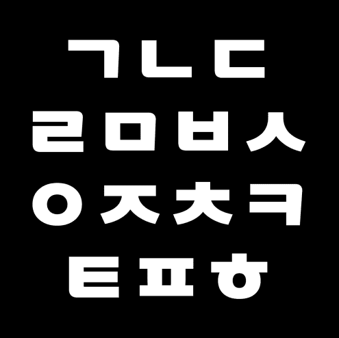
- Research into Korean architecture, traditional symbols and the Hangul alphabet shaped the direction.
- The gateway (a defining element of Korean architecture) became the structural entry point for the logo.
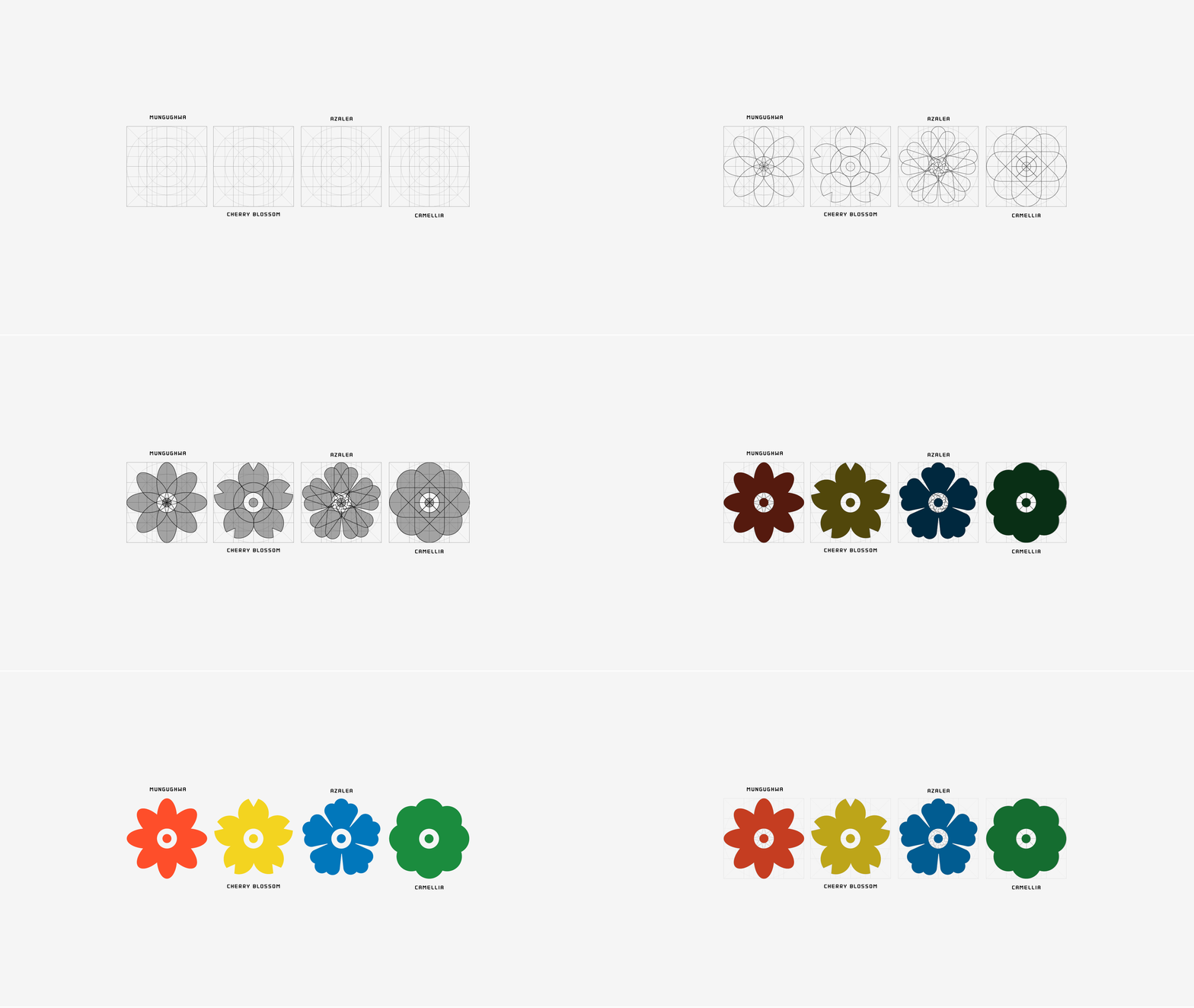
- S, A and M were redesigned from Hangul characters reinterpreted into Latin form. · Four traditional Korean flowers became a graphic icon set representing the range of cultural experiences SAM produces.
- The color palette bridges both cultures: drawing from the traditional colors of South Korea and the vibrancy of Brazil.




→ Result
- 2 logo versions, 6-color palette, typographic system, floral icon set and motion design built to scale across events, digital, print and merch.
- Serious enough to hold its own, flexible enough not to compete with each event's own identity.


